Data Components management
Data Components Management
A data component defines how data returned from an API is shown in the app, using the API and response fields you set up earlier.
Adding a Data Component
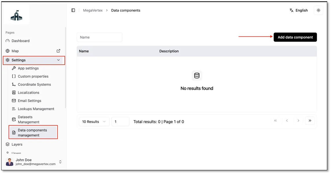
From the side menu, go to Settings > Data components management.
Click the Add data component button.
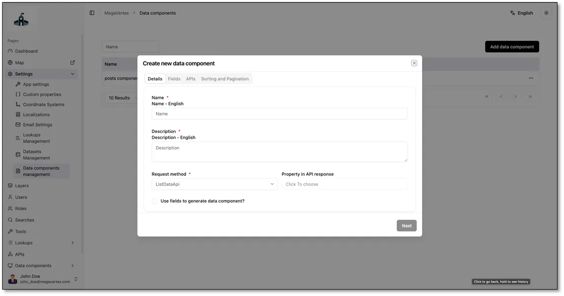
In the Details tab, fill in the following fields:
- Name: a name for the data component.
- Description: a short description of what the data component shows.
- Request method: the API the data component gets its data from (for example, posts).
- Property in API response: the field in the API response that holds the data you want to show (for example, body).
- UseFieldsToGenerateDataComponent: check this to build the data component automatically from the response fields you defined in the API’s Response payload tab.
Click Next.
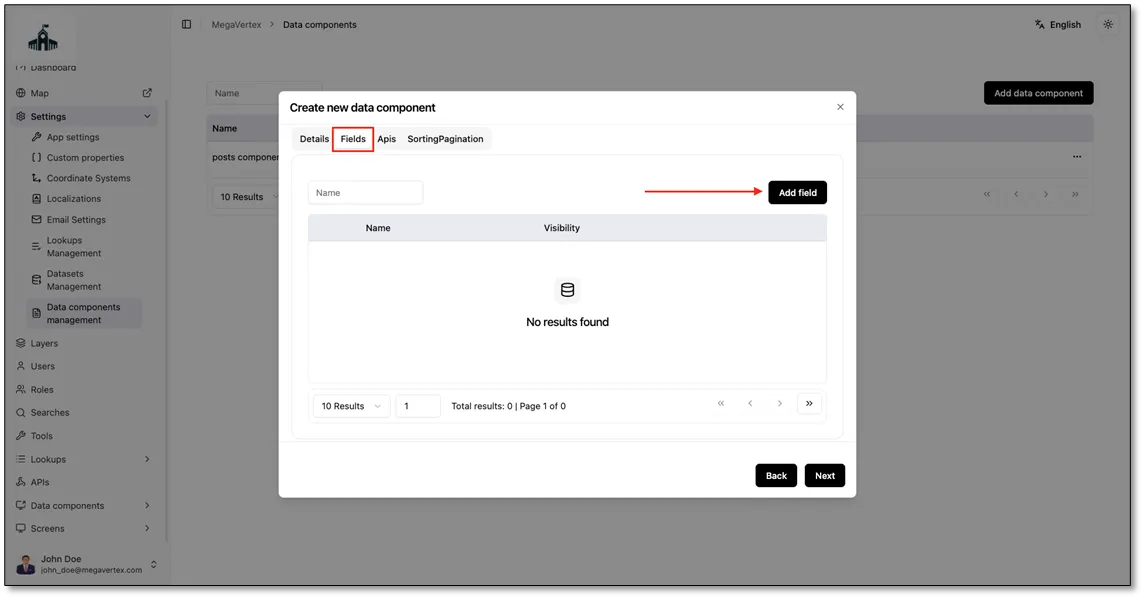
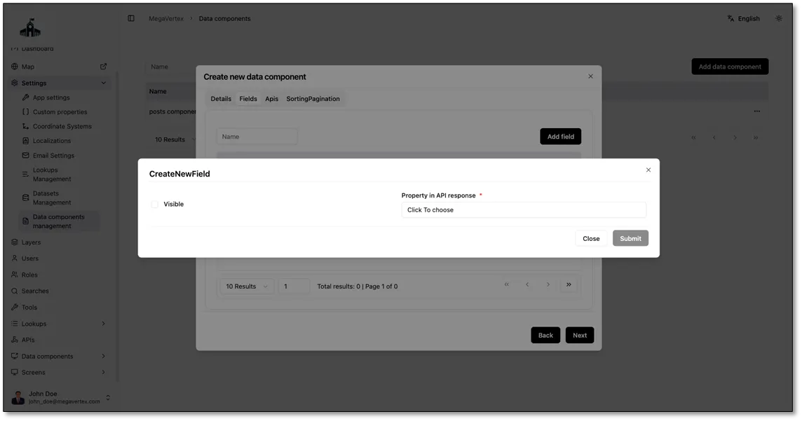
Open the Fields tab. Here you choose which fields from the API response appear in the data component. Click Add field. This opens the CreateNewField form, where you fill in:
- Visible: check this to show the field to users. Leave it unchecked to keep the field in the data component without displaying it.
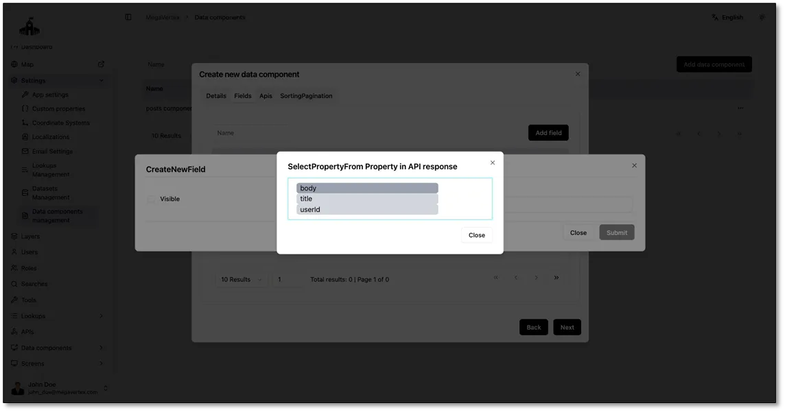
- Property in API response: click the field to open a list of the response fields defined for the API, then select the one you want (for example, title).
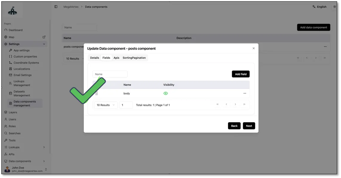
Click Submit to add the field, and repeat for each field you want to include.
Click Next.
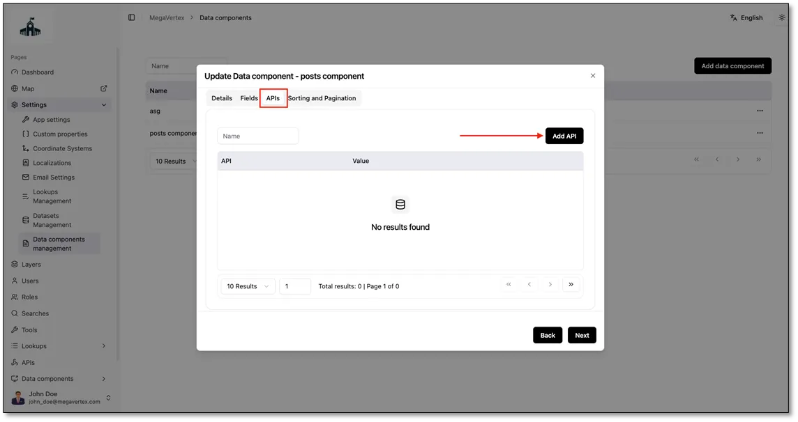
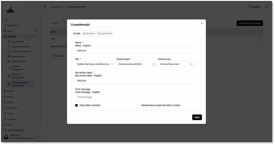
Open the APIs tab. Here you add actions that users can run from the data component, such as adding a new post or deleting an existing one. Click Add API. This opens the CreateNewApi form. In the Details tab, fill in:
- Name: a name for the action (for example, add post).
- API: the API that runs when the user triggers the action.
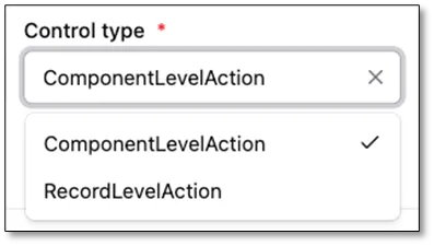
- Control type: where the action appears:
- ComponentLevelAction: the action applies to the whole data component and appears once, such as an Add post button above the list.
- RecordLevelAction: the action applies to a single item and appears next to each one, such as an Edit or Delete button on each post.
- Control icon: the icon shown on the action button.
- Run button label: the text on the button that runs the action (for example, add post).
- Form message: a message shown to users in the form before they run the action, such as instructions on what to fill in.
- Close after running?: check this to close the form automatically after the action runs.
- Reload data component after running: check this to refresh the data after the action runs, so users see the changes right away (for example, the new post appears in the list).
Click Next.
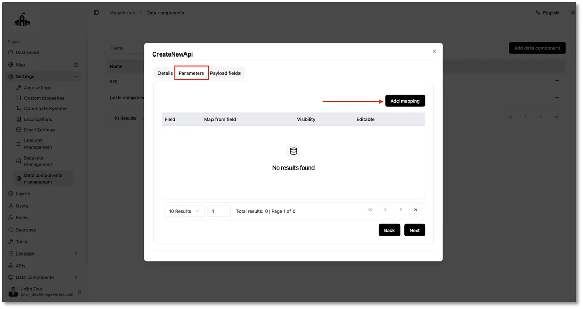
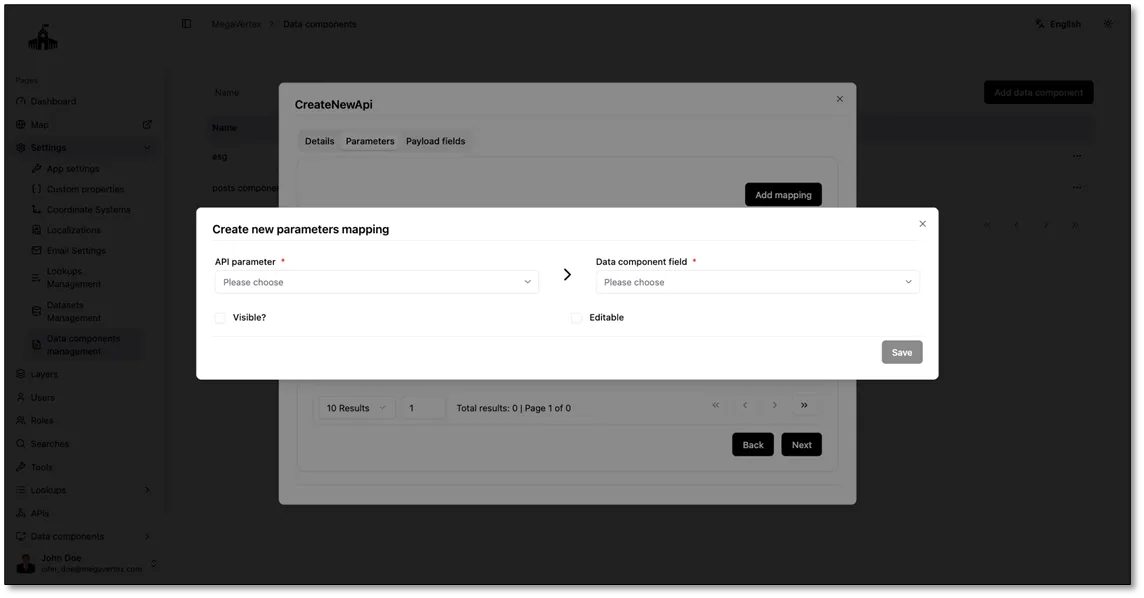
f the API used by this action has parameters, you link each one to a field in the data component here, so the app fills in the parameter value automatically. Click Add mapping. This opens the Create new parameters mapping form, where you fill in:
- API parameter: the parameter of the API you want to fill in (for example, postId).
- Data component field: the field in the data component that provides the value for this parameter (for example, id).
- Visible?: check this to show the parameter to users in the action form.
- Editable: check this to let users change the value before running the action.
Click Save to add the mapping, and repeat for each parameter.
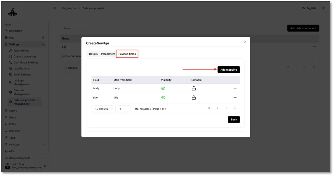
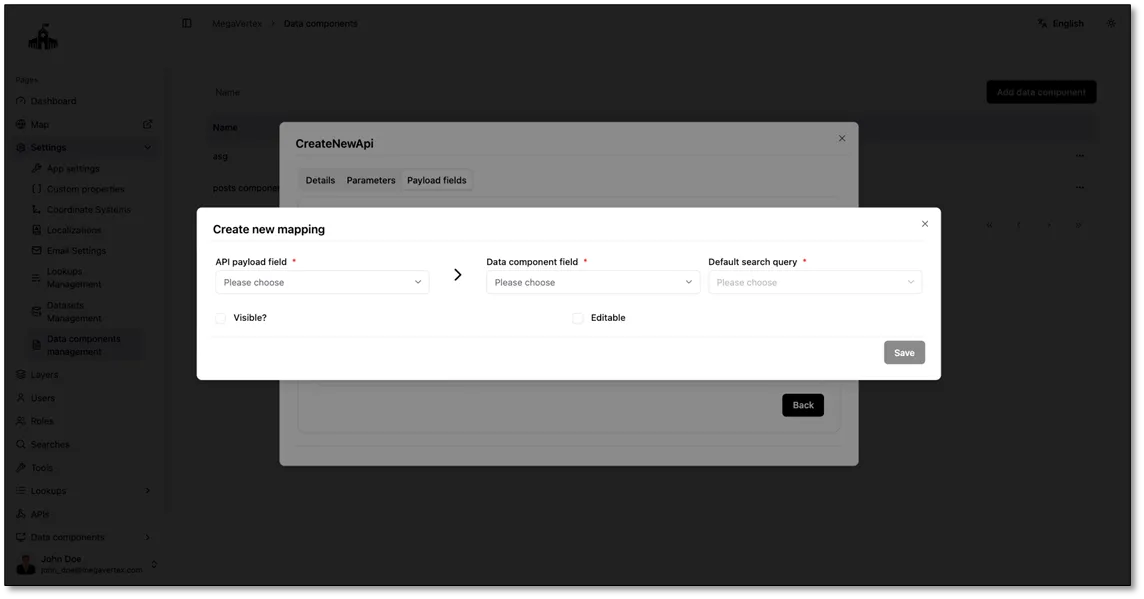
If the API used by this action has payload fields, you link each one to a field in the data component here. Fields with the same name in the API payload and the data component are mapped automatically (for example, title to title), so you only need to add the ones that don’t match. To add a mapping, click Add mapping. This opens the Create new mapping form, where you fill in:
- API payload field: the payload field of the API you want to fill in.
- Data component field: the field in the data component that provides the value for this payload field.
- Default search query: the query used to fill in the value automatically when no value is provided.
- Visible?: check this to show the field to users in the action form.
- Editable: check this to let users change the value before running the action
What is pagination? Pagination splits a long list into smaller pages, like the pages of a book, so the app loads and shows a few items at a time instead of everything at once. This makes the app faster, especially when the API returns a lot of data.
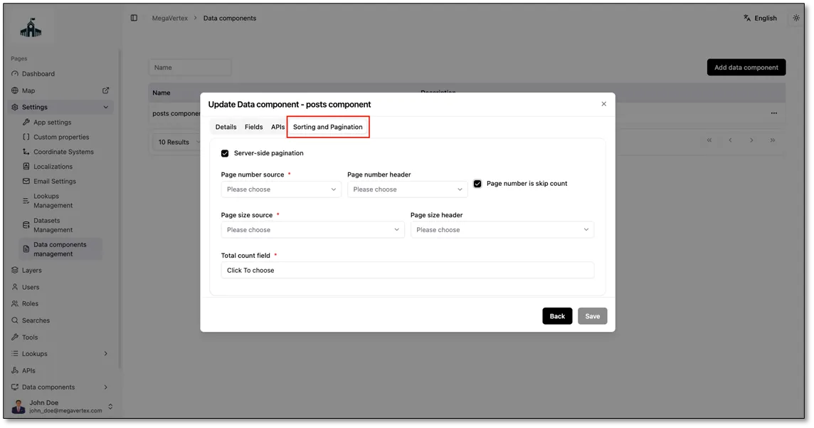
Open the SortingPagination tab. Here you control how the data is split into pages when there are too many items to show at once.
- ServerSidePagination: check this if the API itself returns the data one page at a time. Leave it unchecked if the API returns all the data at once and the app splits it into pages.
If you checked ServerSidePagination, fill in the following fields so the app can tell the API which page to send:
- PageNumberSource: where the page number is sent, such as ApiParameter to send it as one of the API’s parameters.
- PageNumberParameterId: the API parameter that holds the page number. Choose it from the parameters you defined in the API’s Parameters tab.
- PageNumberIsSkipCount: check this if the API expects the number of items to skip instead of a page number. For example, to show page 3 with 10 items per page, the app sends 20 (skip the first 20 items) instead of 3.
- PageSizeSource: where the page size is sent, such as ApiParameter.
- PageSizeParameterId: the API parameter that holds the number of items per page.
- TotalCountField: the field in the API response that holds the total number of items, so the app can work out how many pages there are.
Viewing the Data Component
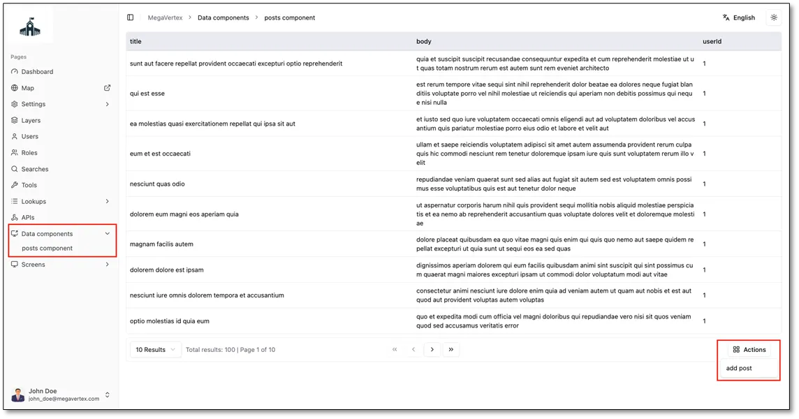
After saving, the data component appears in the side menu under Data components (in this example, posts component). Click it to open a table that shows the data returned from the API, with a column for each visible field you added (here, title, body, and userId). Any component-level actions you added appear under the Actions button in the bottom-right corner; click it and select an action, such as add post, to run it.